I really admire Apple’s brand. I refer to Apple a lot as a brand leader in branding consults with our clients.
Their carefully planned branding communications almost seem effortless, but the simplicity of the communication is what makes Apple’s brand have the consistency we have all come to know and respect.
Sure, there’s a huge marketing department at Apple. Every detail of visual communication goes through a rigorous marketing and design process. But behind every decision, there’s a core foundation – “Is this a ‘brand’ message?” Before a design is signed off, I bet it’s not passed through the team to see if they “think it looks nice”.
This is because personal taste isn’t the foundation of the brand’s decisions. The final say goes to the design, which is most on point with its message in representing the brand. (But I dare say there are no bad designers with Apple marketing – let’s be honest!).
What this means is that good design speaks volumes for a brand, and good design COMMUNICATION speaks clearly and strongly.
In your business, are you selecting visual communication for your brand because “it looks pretty” or “it looks nice” or “it looks professional”?
Perhaps you selected a logo design because “it looks pretty” – is “appealing” and “feminine”, which is a message your brand is trying to send. Could you be sending a stronger message, though, i.e. “trustworthy” or “quality” instead?
Or maybe you have selected a colour scheme because “it looks professional”? Is “professional”, “corporate” and “business” a visual language you’re aiming to communicate? Could you be sending a stronger message like “experienced” or “customer focused” instead, and use a colour palette that subconsciously communicates this to your customer?
You need to detach your personal taste from your brand and keep in mind your message and your customer.
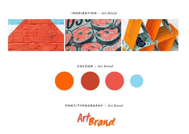
Here’s an example. Just say you’re an artist, and perhaps two of your key brand messages are communicating that your art is “modern” and “creative”. Using our brand and design knowledge, we would suggest the colour orange, coupled with a hand drawn font for your logo and modern illustrative elements communicates this perfectly, just like this brand mood board below:

Orange: symbolises creativity
Font: is one of a kind and creative
Elements: modern and new age
But what if you think green is a better colour because it’s a colour you have always liked, and you found a font you like on Google that you were drawn to and then there’s this heart-shaped symbol that you have always used.
This now communicates:
Green: associated with nature
Font: a traditional typeface
Symbol: represents love
The latter brand persona could be communicated as an artist who is into natural art, with a focus on traditional methods of painting, and your brand has some focus on love; however, now, due to taste being a huge player in the decision-making process, the message of modern and creativity is missed, and the brand is now communicating a different message and in some ways the complete opposite.
This is why understanding your brand’s key message and sticking to it, no matter what your taste, is important to a successful visual communication suite. Just like in the example from Apple.
So how do you create good design, which also achieves a clear and strong communication message? We use a clever method for distinguishing what a brand is communicating and business visioning consults. We like to do this by distinguishing what your “brand persona” is.
Just as no two people share a common personality, two brands are also never the same.
We see that all brands have five personas, and personas are like personality attributes and are emblematic of the vision and values of a brand.
Our 5 week 1-on-1 brand visioning method centres around the idea that brands are most significant when the underlying personality values of the business are communicated through visual language – that is; colours, fonts, experience and messaging.
It’s a simple method we’ve built for small businesses who don’t have big marketing departments like Apple but want to communicate their vision through their design.
We see that your brand personas are what you can always refer to – What brand “persona” is this communicating? This question is one that our clients always have on hand to ask themselves, ensuring they are always on track with their message.
Are you interested in knowing what your brand persona is and working with us 1-on-1 during our brand and business visioning sessions? Click here and I will send you all the information on how we like to find out your individual brand persona attributes. The best part about finding out about your personas is that it’s illuminating and fun!

Co-owner of Verve Design, Teegan’s 12+ years of experience in design and marketing, and her love of mindfulness and meditation brings strategy with intention and creativity with purpose.
