
Do you love a particular colour but aren’t sure what colours might complement it? Ever wondered how to get your brand colours right and know how to use the right colours in your design? Wish you shared professional designers’ knowledge on pairing colours? You’ve come to the right place!
In this article, I’m going to let you in on a design school secret on the topic of colour, as well as a primer on how to select colours for your next design project. (You’re welcome!)
Speaking from my own experience, I can say that professional designers do have a natural instinct when it comes to colours. In a meeting, we may be able to flip through a book, select a few colours and they go together perfectly – that’s our “design eye” at work. It seems effortless, but when I think about it, my design eye was definitely developed through the formal art and design training I had from the beginning. In other words, what appears to come naturally to a designer is actually based in real purpose and theory.
So here’s my explanation of colour theory – understanding this designers’ secret will help you make better colour choices without ever setting foot in design school!
Let’s say you’re about to choose a colour palette for a marketing campaign – you might like a certain colour, but how can you tell which colours will “make great friends” with that colour you like?
A great way to think about colour is by grouping colours into three “friendship groups” – analogous, monochromatic and complementary colours on the colour wheel.
The analogous colours are a group of friends who hang out next to each other on the colour wheel. So, if your starting colour is pink, its besties would be red and purple. Their colour friendship is based on harmony, as reflected in their low colour contrast.
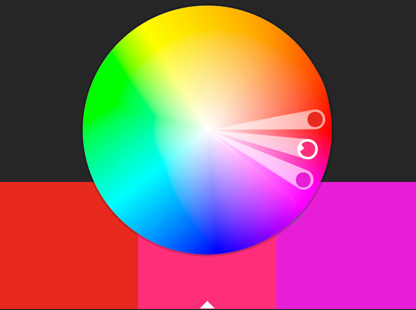
The monochromatic colours are friends who share the same personalities – they’re the same colour in light, medium and dark hues. So, for example, a strong, bright purple’s closest friends would be lilac (light) and eggplant (dark).

The complementary colours share the most radicular friendship of all the colour groups. They’re happy to sit on opposite sides of the colour wheel – but, as opposites attract, complementary colour friends shine most when they’re opposite one another. A good example of a complementary colour friendship is yellow and blue.
Once you’re familiar with how colour “friendships” work, you can begin creating a colour palette for your project.
Here are my tips for how beginners should approach colour:
- Keep your colour palette to no more than four colours in a design; a palette of 2, 3 or 4 colours is best.
- Choose one colour for your “base colour” – this is your background
- Then select a colour for your “secondary colour” – this will be used for additional backgrounds, larger area graphic and body text
- Choose a colour for your “highlight” – this is used for main titles, call-to-action text, banners and buttons
- Finally, choose one colour to “pop” – this is used for small line details, bullet points, small graphics, etc.
All good designs follow this basic procedure, and it’s scalable for smaller palettes.. For example, if you are only using three colours, omit the “secondary base colour” for this theory to work. If you’re using two colours, choose a base and a highlight colour.
Finally, you’ll want to ensure your colours are consistent everywhere in your design. This is important not only for aesthetic reasons, but for branding reasons. You want your customers to recognize your work and for it to appear the same everywhere it’s used. (To learn more about colour consistency and why print and web colours look different, check out this post!)
If you’re looking for a great colour wheel tool like we have used above – check out adobe colour it’s amazing to play with the colour wheel and put the above theory into practice!
Now that you know all about colours, you may still find yourself preferring to leave it to the professionals! Reach out to us if you’re ready for a rich, colourful brand design – or feel free to share this post with someone who does!
Co-owner of Verve Design, Teegan’s 12+ years of experience in design and marketing, and her love of mindfulness and meditation brings strategy with intention and creativity with purpose.