
Ever print something out and wonder why the colours come out looking different to what they did on your screen?
Maybe you’ve heard graphic designers talk in strange languages; using weird acronyms when they’re trying to explain this process to you? They use jargon terms like ‘Additive Colour’, ‘Subtractive Colour’, ‘CMYK’, ‘RGB’, and ‘PMS’ — all the while, you’re pulling your hair out because all you want to know is why the colour is acting funny and of course you want to know how to fix this problem!
First of all, please forgive us — we’re just trying to help you. Colour theory is something we’ve studied and are passionate about, and we want to share our knowledge with you! Kind of like when a doctor explains how your blood vessels work, or when they talk about the difference between good cholesterol and bad cholesterol, or use acronyms and big words like HDL, LDL, and Triglycerides (you get the picture).
We’re not trying to overload you with unnecessary designer jargon, nor are we trying to make you feel inferior. We’re just excited to share our knowledge because we know that it will help you represent your brand in a colour-consistent way! Which is one of the toughest things to get right all the time.
Let’s break it down
The two biggest colour types out there are printed colour and screen colour — which is where we get CMYK and RGB colour (also known as Subtractive Colour and Additive Colour).
First there was Print
Printed colour is probably what you’re most familiar with. It’s what you would’ve learnt about when you started painting in kindy: ‘Yellow and blue make green!’
This is called ‘Subtractive Colour’, or in design terms, ‘CMYK’ (which stands for Cyan, Magenta, Yellow, and Black).
It’s called Subtractive technically because it absorbs the light that’s being shone upon it. That is, it subtracts the light. So you start with white light from the sun or some other light source, then you subtract that light away in various amounts to get your desired colour. If you add all of the colours at 100%, you get black because all of the light has been absorbed.

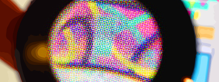
These are the different CMYK ‘plates’ that get printed (in their individual colours). When combined, these colours create the full colour design.
(Incidentally, there is no black in this design at all. Usually there would be the extra plate of black).
And then there was Screen
Colour theory gets really interesting however when yellow and blue make white!
‘Whattttttt?’ you might be asking. This is when you’re using lights, hence the name ‘Additive Colour’.
Think about the technology your computer screen uses or perhaps a projector at the theatre. This Additive Colour is essentially a combination of red, green and blue (or RGB).
With Additive Colour, red and green make yellow, which when you add blue becomes white. This is because you have all the colours being used at the same time.
They call this Additive Colour because you’re adding the light in varying amounts to create colour. This is the exact opposite of print, because you start with black, and with the combination of the three colours you get white.
These are the separate RGB colours that combine to give a mostly white design, thus using lots of light.
So now that the science lesson is out of the way, what does all of this actually mean?
1. Don’t trust your screen or your inkjet
If you’re looking on your computer at a colour that’s meant to be printed, your screen is translating the colours as well as it can to try and show you what it will look like when it’s printed. But it will never be 100% correct. You will only know what it’s going to look like for sure once it’s actually printed.
2. When choosing your brand and/or marketing colours, get help from a professional
Colour is one of the most memorable elements of your brand — and so getting it right is super important. You want your brand to be consistent across all mediums both printed and on screen. There are tools of the trade that designers and printers use to get it right, so let us help you!
3. Know what to give to who: CMYK for Print and RGB for Screen
Be confident! Just remember CMYK for Print and RGB for Screen. So if you want to post a graphic to your Facebook page, use the RGB version of your design. If you’re sending a logo to a magazine, send the CMYK version. That way your brand will always look amazing — regardless of the medium.
Go Forth!
That’s it! Now go forth empowered by this knowledge and never feel intimidated by those fast-talking, jargon-speaking, sugar-coated, graphic designers ever again.
Co-owner of Verve Design, Stephen’s 15+ years of experience in design, illustration and web brings creativity, innovation and the kind of tech knowledge most of us are envious of!