
As designers, it goes without saying that we need to be on the front foot with all kinds of trends; from architecture and interiors to fashion and what’s happening online.
This is because they collectively meld into what’s trending in the graphic design world too!
Just like those baggy 90’s t-shirts, trends in the design world come and go seasonally.
We had a giggle in the office today about the trend from 2010 of ‘flourishes’. Every second design consisted of a ‘flourish’ in one form or another.
We started referencing styles, colours and techniques that had their heyday in years gone by; reminiscing about the projects we’d used these design elements in and how quickly they became common trends.
This little trip down memory lane inspired me to write this post to explore some of the iconic design trends of the last couple of years and share what’s on my trend prediction radar for the next 12 months.
(I bet in 10 years time, I’ll look at this post and have a laugh… Or maybe be inspired to bring back a trend! ha!)
So here’s my countdown of trends from the past couple of years…
2012 – THE HIPSTER
The ‘Hipster’ look has evolved a lot since we first started to see it in 2012. Anchors, arrows, bicycles, birds and other iconically ‘hipster’ design elements continue to make appearances in design today. The look has matured to become a lot cleaner and I think it will continue to be a popular design trend of this decade. #yolo
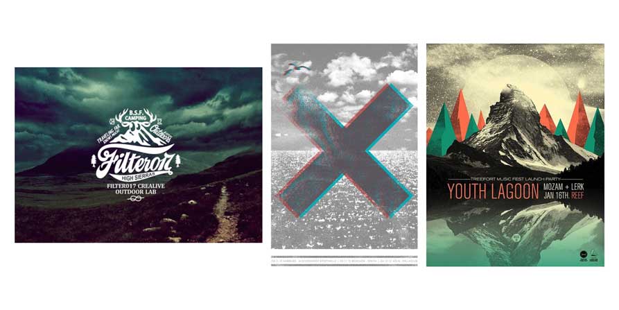
Images: Examples of the ‘Hipster’ design trend.
2013 – THE BLACKBOARD
Perhaps it was the influx of blackboards all over Pinterest for wedding decor or maybe the burgeoning success of Frankie Magazine, but 2013 saw a huge trend of blackboard integrated design that bled into early 2014. The ‘Blackboard’ boasts boldness and masculinity – lending itself nicely to post-war era design styles that also saw a comeback in 2013.

Images: Examples of the ‘Blackboard’ design trend. Can you see the similarities between the building exterior from the 1950s and the ‘Blackboard’ trend from recent years?
The ‘Blackboard’ trend created a springboard for the ‘Handwritten’ trend which followed closely in 2014, where people took more pen to paper, than chalk to board.
2014 – THE HANDWRITTEN
The ‘Handwritten’ trend makes for designs that are distinctly unique, versatile, personal and warm. This suits my values (and those of Verve Design) to a tee and so you can understand why it makes me thoroughly overjoyed to say the ‘Handwritten’ look will be around for a few years yet.
Brands are becoming more personalised as they increasingly use handwritten messages in their marketing materials. This touch doesn’t jeopardise professionalism, it just bolsters trust, warmth and likability between brand and consumer.
Keep an eye out for this trend in the digital realm too with your own handwriting apps available online.
It’s exciting to say more and more designers will be coming together with beautifully unique handwritten fonts and scripts in the coming months – so definitely watch this space!
Images: Examples of the ‘Handwritten’ design trend.
***
It’s fun to talk about trends that have been-and-gone and ones that are sticking around. But as designers, it’s crucial that we’re always ahead of these trends.
When you come to us for the branding of your wonderful business venture, you can be assured that we’re on the ball with our ear to the ground in terms of what’s trending but also using foresight to predict what fonts, colours, elements and techniques are in the proverbial wings waiting to bust out!
The benefit of this is that your branding will be fresh and dynamic for longer – it also means you’ll get an overwhelming response of ‘WOW’ from the marketplace when you launch.
SO WHAT AM I PREDICTING FOR THE NEXT 12 MONTHS?
Mystics
Late last year, gemstones and mystics really started to take serious ground in fashion and architecture, and I’m just going to put it out there that I think we’ll see this more and more in our design elements this year.
Think watercolour with interesting textures and mystical curiosity! This will also be paired with starry nights, universe-like ethas and imaginative skies.
Take, for example, these Natural Agate coasters from Urban Outfitters.
Image credit: Urban Outfitters.
Here’s an example of some savvy designers already using this trend – inspired by Natural Agate to create these gorgeous prints.
Image credit: Beneath The Sun.
And starry nights, skies and magical worlds, like this mystical stars book cover by Susan Stefanizen.
Image credit: Susan Stefanizen.
And this beautiful artwork by Danny Jones.
Image credit: Danny Jones via Dribbble.
Bronze Foil
There aren’t many embellishments in print that I can say I love more than foil! We’ve seen foil gaining prominence in the last 12-18 months – but this has been predominantly gold and silver.
Now – Bronze Foil is making a huge amount of noise in the design sphere! And doesn’t it look lush!!? We can’t wait to use it this year on some of our invitations and/or desk stationery.
Bronze Foil is striking against black – or white backgrounds, like in this branding for Penny Royal Films.
Image credit: BP&O.
Here’s how Bronze Foil has been cleverly paired with mystics!
Image credit: Design A Emporter.
I know we’ll be incorporating these emerging design trends in our work this year – I hope they’ve inspired creativity in you too!
Have you got a design trend prediction? We’d love you to share below.
Co-owner of Verve Design, Teegan’s 12+ years of experience in design and marketing, and her love of mindfulness and meditation brings strategy with intention and creativity with purpose.